

Open almost any commercial website in 2026, and you meet the opposite of Jony Ive’s design philosophy: a cookie banner climbing over the headline, a pop-up offering ten percent off before a single word has been read, a chat bubble waving from the corner, and a carousel that slides away the moment the eye settles. Beneath that surface sits a second website that no visitor ever sees, written for a reader with no eyes at all. Search engines, AI answer engines, and the browser agents now being tested in Chrome do not look at the carousel. They read the markup, the structured data and, increasingly, the actions a site declares it can perform. One reader feels. The other parses. Every website is now addressed to both, and most are serving neither particularly well.
The designer who spent nearly three decades shaping Apple’s hardware left behind a definition of simplicity that turns out to be unusually exact for this moment, more exact, perhaps, than he could have known when he said it. It was never about removing things. It was about knowing what a thing is.
What Jony Ive’s design philosophy actually asked for
Ive joined Apple in 1992 as a young London designer, years before anyone outside the company knew his name. After Steve Jobs returned in 1997, the two formed the partnership that produced the translucent iMac of 1998, the iPod, the iPhone and the iPad. Ive later recalled, on BBC Radio 4’s Desert Island Discs, that Apple was only days from bankruptcy when work on that first iMac began. He left in 2019 to found the independent design firm LoveFrom with Marc Newson.
His work is usually summarized as minimalism, but that summary is precisely the misunderstanding he spent years correcting. On the day he received his knighthood at Buckingham Palace in 2012, he told The Telegraph that an uncluttered object is only a side effect of simplicity, not its substance. A product can be clutter-free and still not simple. He said simplicity is “describing the purpose and place of an object.”
Read that line slowly, because it contains an entire theory. In Ive’s account, simplicity is not a visual style. It is an act of description. It begins as knowledge: what is this object for, where does it belong, what does it owe the person who will hold it? Only after those questions are answered does it become form, and when they are answered completely, the form feels inevitable, as though it could not have been made any other way. Ive admired the German designer Dieter Rams, whose motto “less but better” follows the same order of operations. “Better” comes first in meaning, even when “less” comes first in the sentence.
When Apple introduced iOS 7 in 2013, Ive described true simplicity as a matter of “bringing order to complexity.” Order is a property of understanding. Nobody can bring order to something they do not understand; they can only hide it. That is the first lesson, and everything else here depends on it: simplicity is downstream of truth about the object. Get the truth wrong, and no amount of white space will rescue the design.

The noise was never the machine’s idea
It is tempting to blame the clamor of the modern web on the machines, to picture interfaces assembled by data-hungry systems that measure everything and feel nothing. The history is less comfortable than that, because the noise was human first.
In March 2009, Douglas Bowman, Google’s visual design lead, resigned and explained why on his blog. He wrote that a team couldn’t choose between two blues, so they tested 41 shades between them to see which performed best. He was asked to prove, with data, whether a border should be three, four, or five pixels wide. He said he would not miss a design philosophy that “lives or dies strictly by the sword of data.”
The data was not wrong. It was answering a smaller question than the one design exists to answer. A test can reveal which blue earns more clicks. It cannot reveal what the page is for. Multiply that habit across fifteen years, and you get the interface described at the top of this article: every pop-up, nag, and countdown timer individually justified by a metric that went up, collectively incoherent because no one ever asked what the whole was for. The pattern became pervasive enough that the European Union legislated against it. Article 25 of the Digital Services Act forbids online platforms from designing interfaces that deceive or manipulate users or materially impair their ability to make free and informed decisions.
Artificial intelligence enters this story not as the author of the noise but as its heir. Generative models learned from the web we built, and when asked to produce an interface or an optimization plan, they reproduce its habits fluently and at scale. The real danger is not that silicon has poor taste. Optimization without purpose can now be automated, and automation never gets tired of debating border widths.
Meanwhile, the person on the other side of the screen still reads the way people always have. Recalling his first encounter with a Mac as a student at Newcastle Polytechnic, Ive told Desert Island Discs: “I was shocked that I had a sense of the people who made it.” That is the human reader in a single sentence. People sense the maker. They sense care, Ive has argued elsewhere, as surely as they sense carelessness, even when they cannot say what they are sensing. On the same program, he said he feels responsible for the iPhone’s unintended downsides, and that this weighs on his decisions now. A designer who carries that kind of responsibility is not designing for a dashboard. He is designing for a person who will feel the result.
A second reader has come to every website
The other reader is newer and growing quickly. In 2024, the research firm Gartner forecast that traditional search engine volume would fall by a quarter by 2026 as people turned to chatbots and virtual agents for answers instead. Whether that figure lands exactly matters less than the direction it named. A rising share of people now meet a business first through a model’s summary, and soon through an agent acting on their behalf.
That reader does not see color, rhythm, or motion. It reads structure. Since 2011, Google, Microsoft, and Yahoo have backed Schema.org, a shared vocabulary that lets a page state, in machine-readable terms, that this is a product, this is its price, this is an event happening at this address on this date. In September 2024, Jeremy Howard of Answer.AI proposed llms.txt, a plain Markdown file at a site’s root that tells language models what the site is and which pages matter most. It remains a community proposal rather than a ratified standard, and it’s still unclear how much major AI providers actually rely on it. In 2026, Chrome began trials of WebMCP, a proposal Google and Microsoft developed through a W3C community group. It lets a website declare its actions, such as searching flights, filing a support ticket, or configuring a product, as structured tools an agent can call directly instead of guessing which button to press.
Strip away the acronyms and each of these does the same thing. It tells a reader without eyes what a page is for and where it belongs. Purpose and place. The machine layer of the web is Ive’s definition of simplicity, written down in a format a model can parse.
Some 2,500 years ago, Confucius made the same demand of language itself. When asked what he would do first if entrusted with government, he answered that he would rectify the names, zhèngmíng (正名), because, in James Legge’s translation: “If names be not correct, language is not in accordance with the truth of things.” Structured data is the rectification of names for the web. A site that names its things correctly gives every agent reading it a chance to act correctly. A site that names them falsely exports that falseness into every answer built upon it.
When the inside and the outside disagree
Two readers create a new temptation: telling each of them a different story. Search engine optimization has an old name for the crude version. Google has long treated cloaking, showing crawlers one page and people another, as spam. The subtler versions are harder to spot. Structured data can promise a price that the checkout quietly inflates. A calm, well-summarized page for the AI can sit on top of a maze of upsells for the human. Or the reverse: a beautiful human page with no machine layer at all, invisible to the agents that increasingly stand between people and the web.
Ive’s answer to this temptation was formed long before anyone had heard of an AI agent. In that same 2012 interview, he spoke about his father, a craftsman, and about finishing the back of a drawer that no one would ever see. He admitted it’s difficult to defend on purely rational grounds, yet it shows you care for the people you make things for. He also described a worry that industrial mass production would carry with it a kind of godlessness, a loss of care. The work he wanted to do was a refusal of that loss.
For most of history, the back of the drawer had no audience. Now it does. The structured layer of a website is the back of the drawer, and for the first time in craft’s history, systems read it, summarize it, quote it, compare it, and act on it on someone’s behalf. The hidden side of the work has become the side that speaks first.
Chinese has a four-character phrase for the quality this demands: biǎo lǐ rú yī (表里如一), outside and inside as one. It describes a person whose conduct matches their heart, whose public words and private thoughts come from the same place. The phrase was never about websites, yet it describes the only stable architecture for a web with two readers. Truthfulness here is not a branding virtue. It is the condition under which anything can be trusted by more than one kind of reader at once.
The principle holds at every scale. A craftsman’s drawer, a person’s character, and a software system all obey it. When what a thing is and what it shows come from different places, tension accumulates in the gap. Every inconsistency must be maintained, defended, and eventually discovered. When both come from the same place, nothing needs maintaining. That is simplicity in its deepest sense: not fewer elements, but no gap.

One truth, projected twice
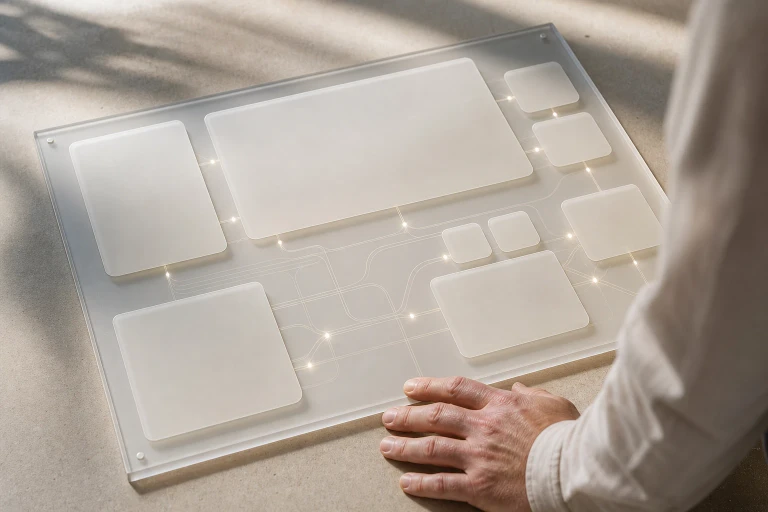
So how do you build for both readers without betraying either? The answer is architectural before it is visual. Engineers who think in systems already know the pattern. An interface should project the system and hold no logic of its own: inputs flow into a single source of truth, and everything displayed is projected from it. Apply that to the two-reader web and the design becomes clear. One semantic core models what a business is, what it offers, what it costs, where it stands, and what it can do. From that core come two projections. The machine projection carries structured data, an llms.txt index, clean Markdown versions of key pages, and declared tools for agents. The human projection is the visual interface. Neither is derived from the other. Both derive from the core, so they cannot drift apart.
Here is the part that should make designers optimistic. For two decades, human-facing pages carried a burden that was never theirs: paragraphs padded with keywords for crawlers, link-heavy footers, frequently asked questions nobody asked, word counts inflated to rank. Much of the clutter Ive rejected existed because one surface had to serve two readers at once. Give the machine its own layer, served from the same truth, and free the human page from that duty. The structured layer can hold completeness, every specification, every price variant, every opening hour and policy clause, so the visual layer holds only what a person needs to understand, decide, and trust. Served properly, the machine reader may be the best thing to happen to human simplicity in a generation.
A few working principles follow
Describe before you design; if the purpose and place of a page cannot be written down plainly in structured form, no visual treatment will save it.
Let agents do what humans can do, on the same terms; a declared tool should mirror a human path, with the same prices, the same consent and the same conditions, never a shortcut around them.
Use data to verify, not to decide purpose; a test can choose between two blues once someone has decided what the page is for. And test for parity. Ask an AI assistant what your page offers, then look at what a person sees. If the answers differ, check your own site before you blame the model.

Ive himself has moved toward this future
In May 2025, OpenAI agreed to acquire io, the hardware startup he co-founded, in an all-equity deal valued at about $6.5 billion, and Ive and LoveFrom took on the lead in design work across the company. Sam Altman has said their first device will be more “peaceful” than a smartphone. Its timing has slipped: a court filing earlier this year said it would not ship to customers before the end of February 2027. Whatever form it takes, its premise is the one traced here. As machines take over more of the reading, the surface people touch can grow quieter, as long as the truth underneath is whole.
Return, then, to the page at the top of this article, and imagine it rebuilt. The consent notice stays, short and honest, because the law and the reader both deserve it. The discount pop-up is gone, because it served a metric rather than a purpose. The carousel gives way to a single clear sentence about what the business does and for whom. Underneath, unseen by the visitor, the business’s full truth sits in a form any agent can read, act on, and repeat without distortion.
The person will feel whether anyone cared. The machine will read what the page is. Both will be answered from the same source. In the end, there was never meant to be a second website, only the back of the first one, finished with the same care as the front.
Follow us on X, Facebook, or Pinterest
